
Chitkara Business School Signs pact with ALPHABETA Inc for FinTech courses
Blog
February 15th, 2021


 Comments
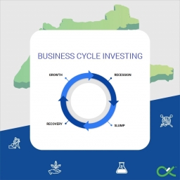
Business Cycle Investing: A fresh approach to Stock Markets
Business cycle investing is a whole new approach to medium and long-term investing in the stock market, where investors follow business cycles, and focus more on the performance of individual sectors rather than individual stocks. Business cycle investing makes sure investors, at all times, are invested in sectors that are on the rise. It follows a top-down approach – first identify the phase of business cycle, followed by sectors that have historically done well during that phase, and finally individual stocks within the chosen sectors that have a potential upside in the near future.
There are 4 phases of any business cycle – growth, recession, slump, and recovery. Growth phase is signified by strong growth in output, increase in corporate profits and high tax revenues for governments; Recession phase by falling capacity utilisation, and falling output growth; Slump phase by below normal capacity utilisation, high risk aversion among investors, and weak demand among consumers; and Recovery phase by increasing output growth, rising inflation, and improving credit growth. Macroeconomic conditions, and fiscal and monetary policies being implemented by governments and central banks can extend or shorten a particular phase during a business cycle.
OUR STUDY
The objective of our study is to identify whether investment allocation to any sector should be decided by the current phase of business cycle or not. And if yes, how do we identify such investment opportunities in a timely manner (with the help of a clear entry and exit strategy) in order to get maximum possible returns on our investment.
Using GDP (Gross Domestic Product) growth rate, IIP (Index of Industrial Production) growth, CPI (Consumer Price Index) inflation, and 10-year bond yield data for India for the last 10 years, we have identified different phases of the business cycle, and tracked the performance of 6 major sectors of the Indian economy – Automobiles, Banks, Fast-moving Consumer Goods or FMCG, Metals, Pharmaceutical, and Information Technology or IT, during each phase of the business cycle. The study includes data for the last 10 years, starting from 2010-Q1 till the 2020-Q2 (latest available data).
A combined indicator was then devised to capture the effect of GDP growth rate, IIP growth, CPI inflation, and 10-year bond yield together into a single number between 0 and 1. This helped us in identifying different phases of previous business cycle(s). The combined indicator is calculated by giving each parameter a different weight as shown below:
CI = 0.30*adjusted GDP growth rate + 0.30*adjusted IIP growth rate + 0.20*adjusted CPI inflation + 0.20*adjusted 10-year bond yield
A value of more than 0.7 indicates the economy is currently in a growth phase, less than 0.7 indicates a recession, and an increase in the value of CI in 2 consecutive quarters indicates the beginning of a recovery phase in the business cycle, and a sharp fall in CI below 0.5-0.6 indicates a slump phase.
Using the combined indicator (CI), four major business cycle phases were identified over the last 10 years – Growth phase from 2010-Q1 to 2015-Q1, Recession phase from 2015-Q2 to 2017-Q2, Recovery phase from 2017-Q3 to 2019-Q2, and Slump phase from 2019-Q3 to 2020-Q2. The performance of each of the 6 major sectors of the economy across business cycle phases are summarised below:
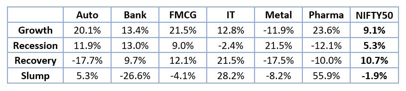
Performance here refers to the increase in the value of the index in that timeframe. All percentages in the above table are on an annualised basis (CAGR). We can then look at the relative performance of each sector in comparison to the benchmark. The relative performance of the sectors in comparison to the benchmark is summarised below:
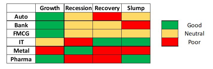
Green indicates that the sector has performed pretty well compared to the benchmark, yellow indicates a neutral or moderate performance, while red indicates a poor performance.Performance here refers to the increase in the value of the index in that timeframe. All percentages in the above table are on an annualised basis (CAGR). We can then look at the relative performance of each sector in comparison to the benchmark. The relative performance of the sectors in comparison to the benchmark is summarised below:
RELATIVE STRENGTH – A PRACTICAL APPROACH TO BUSINESS CYCLE INVESTING
We now understand how business cycle investing works – invest into sectors that have historically done well during the current phase of the business cycle in order to maximise returns on your investments. To identify such sectors, we make use of the concept of Relative Strength or RS, not to be confused with Relative Strength Index (RSI), which is a different technical indicator altogether.
But before we jump into Relative Strength, we need to understand what trendlines are, and how to draw one. A trendline is a line on a stock chart that connects two or more price points. Trendlines are made by connecting the highs or lows in the candlesticks chart. Trendlines help in establishing the current or past trends in a stock’s price. For our study, we will use trendlines that pass through at least 3 points.
Another thing to keep in mind are relative strength charts or ratio charts. RS charts compare the performance of one security (a sectoral index in our case) to another security’s price (a benchmark index – NIFTY 50 in our case). An RS chart basically shows how the ratio of the index to the benchmark’s price has changed over time.
Whenever an index shows a breakout above a downtrend line, it indicates the index is starting to outperform the benchmark, and indicates taking a long position would be a good option. A breakdown below an uptrend line indicates the index is underperforming compared to the benchmark, and indicates squaring off the earlier long position by selling the securities.
Now, let us see what a RS chart (or ratio chart) looks like:
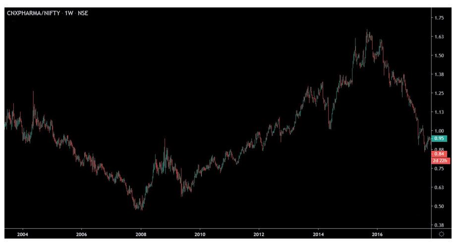
This is an RS chart to compare the performance of NIFTY Pharma index with NIFTY 50 from 2004 to roughly the end of 2017, drawn for a weekly timeframe. The RS chart looks pretty much like a normal candlestick chart for a stock. On the top left corner, you can see that the chart is simply a plot of the value of the ratio of the CNXPHARMA index to NIFTY index.
Now, let us identify and indicate trendlines on this chart. An uptrend line is made by joining two or more lows, and a downtrend line is made by joining two or more highs on the chart.
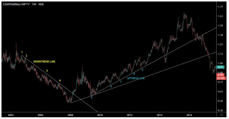
The trendline highlighted in yellow is the downtrend line, made by joining the points 1, 2, 3, and 4. The uptrend line is the one highlighted in blue (turquoise), made by joining the points 5, 6, and 7. The line has been tested two more times near points 8 and 9, which make the trend all the more reliable.
Finally, let us identify the entry and exit points in this chart.

The entry signal is generated after point 4 on the chart, where the price ratio breaks out above the downtrend line, around the start of 2008. The exit signal is generated after point 9 on the chart, where the price ratio breaks down below the uptrend line, around mid-2014. This is the same time period which we have identified as a growth phase in the business cycle using our previous analysis using macroeconomic data, and identified pharmaceuticals as one of the better performing sectors. Let us compare the performance of the CNXPHARMA index with the benchmark (NIFTY 50 index) during this timeframe.
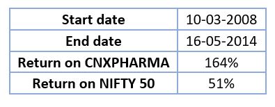
The return on the NIFTY Pharma index is roughly 164% in this time period, as opposed to a 51% return in the benchmark (NIFTY 50), which validates our hypothesis.
CONCLUSION
Identifying the current phase of business cycle, and then investing in the appropriate sectors is the crux of business cycle investing. It ensures investors put their money in the right sector at the right time. Business cycle investing is indeed a useful strategy for investors, as validated by historical data.
Trendlines in relative strength charts (or ratio charts) help investors in putting this theory of business cycle investing to use, by identifying sectors that could potentially do well, and appropriately take positions in them. Breakouts above downtrend lines, and breakdowns below uptrend lines generate the appropriate entry and exit signal for investors. The same was validated by our example of the CNXPHARMA index from 2008 to 2014, where the Pharma index substantially outperformed the NIFTY 50.
REFERENCES
- The Stages of a Business Cycle - Thenewsavvy
- ICICI Prudential Business Cycle Fund
- Technical Indicators - Stockcharts
- Inflation OECD
- GOI MOSPI
- India GDP growth rate - Tradingeconomics
- India 10yr Bond Yields - Investing
- NSE Historical Data